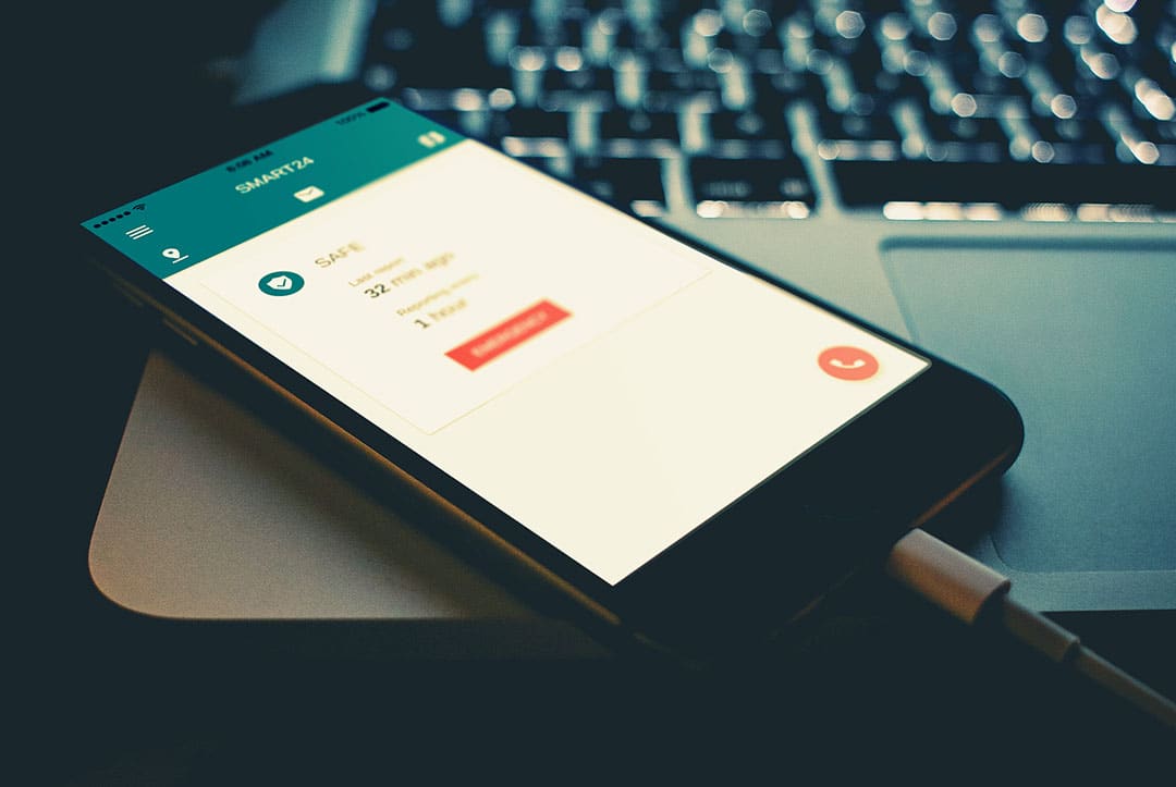
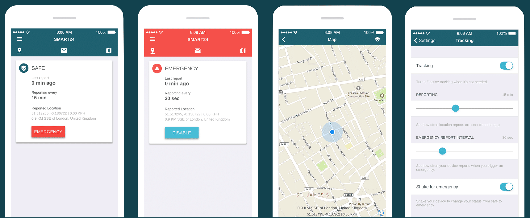
Here at Track24 we strive to improve the design of our products along with implementing the latest tracking technology. In this blog post, I will give a short overview of how and why we redesigned the user interface (UI) and experience (UX) of our location-sharing app.
A core concern for anyone using our app is the ability to signal that they are in an emergency situation. Check in, messages and map view are a secondary type of information which can be placed in a less prominent way. The core feature of the app is a users ability to trigger an emergency.
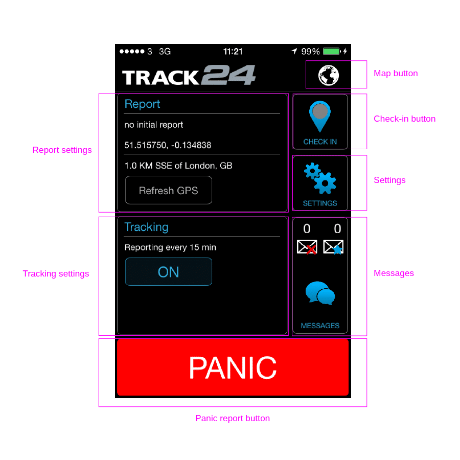
First stage redesign versions
How do we define our design principles?
Visual hierarchy – using contrast in size and/or colour to distinguish the most important elements on the screen
Grouping similar data and actions – rearranging similar type of information to be found in one place
Repetition – consistently using same action logic instead of inventing new ones
In the original version of the app, the panic report did not let the app user know if someone had received the report. That was one of the main aspects in clients feedback as a user needs to get a response to their actions. Secondly, the status change is a continuous action and might not end after an alert has been sent. The new version considered these aspects and moved the app to display a status change rather than sending a one way message.
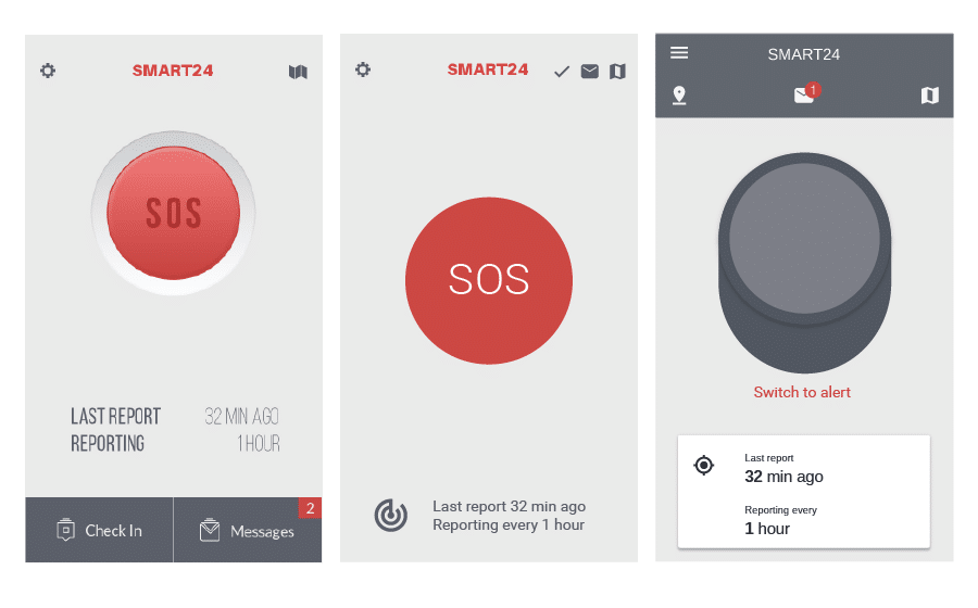
Second stage redesign versions
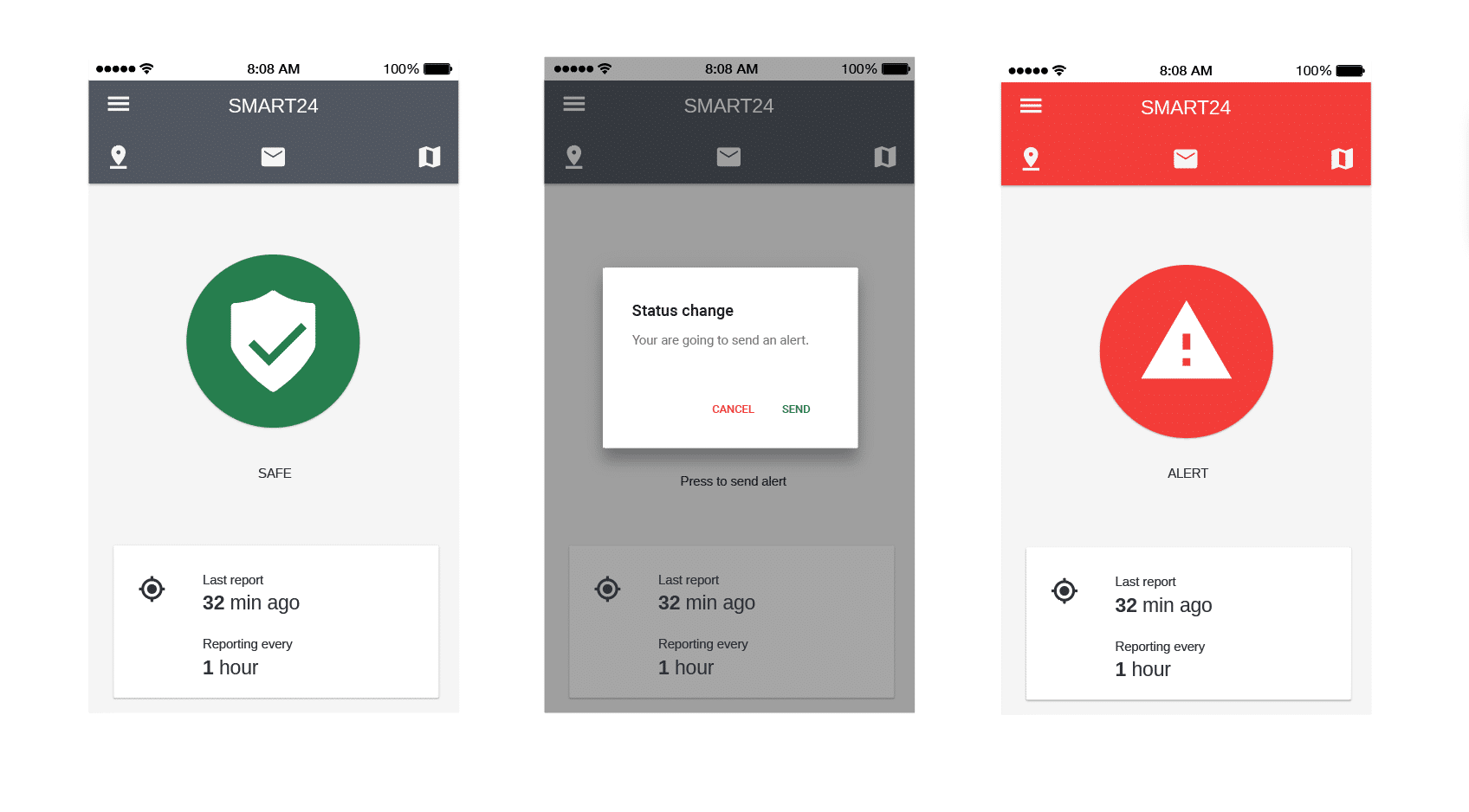
In the final version of the app, we made the status change between ‘safe’ and ‘emergency’ very clear. By using a card pattern containing shared location data and a button for a status change.
Final version
